Showing posts with label Shelf Candy Saturday. Show all posts

Friday, April 27, 2012

Shelf Candy Saturday


Here we are again! I hate when I miss Shelf Candy Saturday so I decided to do it tonight before I go to bed. Yeah, I'm a bit of a night owl.

Let's get down to the details, shall we? Shelf Candy Saturday is a meme hosted by the lovely ladies over at Five Alarm Book Reviews. It's purpose is to showcase cover art that we find beautiful/interesting/unique/intriguing, etc.

This weeks book is Possess by Gretchen McNeil!

Rule #1: Do not show fear. 
Rule #2: Do not show pity. 
Rule #3: Do not engage.
Rule #4: Do not let your guard down.
Rule #5: They lie.
Fifteen-year-old Bridget Liu just wants to be left alone: by her mom, by the cute son of a local police sergeant, and by the eerie voices she can suddenly and inexplicably hear. Unfortunately for Bridget, it turns out the voices are demons – and Bridget has the rare ability to banish them back to whatever hell they came from. 
Terrified to tell people about her new power, Bridget confides in a local priest who enlists her help in increasingly dangerous cases of demonic possession. But just as she is starting to come to terms with her new power, Bridget receives a startling message from one of the demons. Now Bridget must unlock the secret to the demons' plan before someone close to her winds up dead – or worse, the human vessel of a demon king.
I have to admit I have never read this book. I have not even actually heard of this book until about ten minutes ago. If I don't have a book off the top of my head that I want to feature, I generally go on goodreads and just start flipping through book covers. I've actually discovered some really great books this way. This one definitely sounds pretty interesting. Even more intriguing than the summery, of course, is the cover!  (That is what caught my eye, after all!)

Is this one of the creepiest, most eerie covers you have seen?! I don't know how I missed this one up until now. I love how everything around the girl is blurred. It leaves me wondering if the trees are a part of her or if she is translucent? It looks like the trees disappear beneath her shirt in the lower left hand corner and beneath her hair that is laying over her shoulder. I want to know what those trees represent. Are they the demons? A manifestation of the voices? The colors featured on the cover are perfect to give off that creepy sort of feeling that should come along with a book about demons and demonic possession.

Since I haven't read the book, I can't tell you if it is an out of the ball park sort of 'wow' book but I can say, I definitely the cover is and I am adding this book to my TBR pile for when I feel the need for a piece of nice, creepy, YA fiction!

Saturday, April 7, 2012

Shelf Candy Saturday


I have missed a couple of Shelf Candy Saturday and that makes me sad because we all know how much I love them! Let's get down to the details, shall we? Shelf Candy Saturday is a meme hosted by the lovely ladies over at Five Alarm Book Reviews. It's purpose is to showcase cover art that we find beautiful/interesting/unique/intriguing, etc.

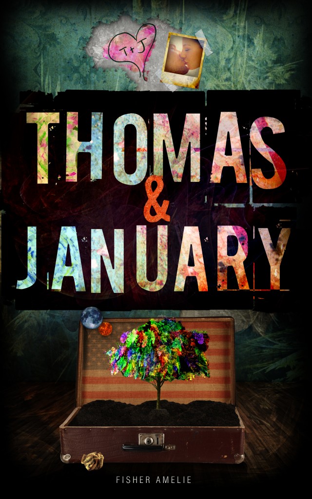
This week, I am showing some more cover love for Miss Amelie. She revealed this cover over on her blog and if you want to find out more about Thomas & January (which I am so ridiculously excited about!!) head on over to her blog where you can read the first chapter! Also, if you haven't read Callum & Harper yet, you should go do that immediately. Shoo! It's on Amazon and B&N and it will be the best $2.99 you have ever spent!


So, on to this cover. If you read my previous shelf candy's you will know that I LOVE the cover to Callum & Harper and I might love this cover even more if that is possible. I am so intrigued! We'll start with the top half. I absolutely love the delicate pattern in the background. It looks like maybe a mix of leaves and ferns. It is subtle and classy looking, almost giving the background a texture of its own. It reminds me of really old wall paper and I think it is the perfect backdrop for the photo and the heart with the initials. I love the photo. It looks young and innocent and the scotch tape is a perfect addition to make it look even more real and authentic. The heart is so very young love, it just screams it. 

The colors and patterns inside the letters of the title complete grab your attention, as does the dark purple background color. You can still see the faint etching of the leaves and ferns but they seem a bit more hidden. It's an awesome contrast and really makes the title pop off of the cover. 

The bottom, to me, is the most intriguing of all! A suitcase? Briefcase? Lock box? It looks like a really old style suitcase to me. There's a lot going on there. The planets, Earth and Mars? I want to know what they symbolize within the story. The American flag combined with the suitcase makes me think of travelling..or new beginnings...it could mean so much! It really keeps you guessing about what exactly could go on within the pages of this book. It's intriguing and curious. The tree is beautiful with all the colors, so vibrant against the otherwise somewhat muted colors of the bottom half of the cover. Why is it so colorful? Why is there a tree planted in a suitcase of soil? What is that crumbled up piece of paper in front of the case? So many questions! Yet again, this cover does exactly what it should. It catches the eye of the reader, draws them in and makes them want to know more about the book. 

Also, as a side note, I love how she has continued with the same sort of theme for the cover that Callum & Harper had. I think the two books would look beautiful side by side on a book shelf! 

Saturday, March 10, 2012

Shelf Candy Saturday


I am running a little behind on everything this month it seems. I started volunteering at a local animal shelter two or three days a week plus I started my internship two weeks ago so I have been trying to rearrange my schedule to make everything fit all nicely together once more! I hate feeling all unorganized and out of whack. I am thinking by next week I'll have a system going on that works in working, studying, volunteering, reading, blogging, working my own four dogs, cleaning and making dinner for the family. (I only make one meal a day. The rest is a free for all. Don't worry, it is just the husband that I starve - no kids!) So I sincerely apologize for being MIA for the past week but hopefully everything will settle down starting this week so I can keep up with everything easily once again. New schedules suck!

Anyways, on to Shelf Candy Saturday! Shelf Candy Saturday is a meme hosted by http://fivealarmbookreviews.com. The purpose of the meme is to highlight book covers that we find interesting/beautiful/unique!

This week I chose 2 books, actually. I haven't read either one of the books and know very little about them. Actually today will be the first time that I have even read the blurbs so the stories themselves in no way influenced my choices.

The first book I chose is Touch by Jennifer Snyder.

Seventeen-year-old Rowan Harper knows her life is forever changed the moment her schizophrenic mother commits suicide. What Rowan doesn’t realize is how much her mother’s choice altered her own fate. It’s not until after meeting Jet, a sapphire-eyed dead boy, Rowan begins to learn of her new destiny as becoming her mother’s replacement for something she never knew existed. 
First of all, the font seems very plain to me and way too big. Maybe a different color would have worked better. The white stands out but I am not so sure that it is in a good way. I do like that it is kind of faded though, it is a cool addition. 

The picture itself is beautiful, the muted colors really speak of a desolation and loneliness. The field she is standing in is empty, isolated and very much emphasizes the 'alone' theme. The birds circling around seem ominous to me, like the carrion birds just looking for their next meal. They might be crows which are a symbol of death in some cultures...I don't know. To be honest though, I hate birds. One of my big phobias and I know nothing about them. They frighten me. It could be a parakeet and it would still terrify me. Birds are scary. 

The other obvious thing on this is the way the girl is dressed. If I had not just read the blurb, I would think maybe this is a steampunk novel of some sort. I want to know why this girl is dressed like this! She's so skinny and her clothing is so out of date. I don't know how this relates to the story at all. I don't get it. Is it because there is a dead boy involved in the story? Is he from this era? No clue. What it all comes down to though is that the cover is strikingly, hauntingly beautiful and I like it a lot. 

The next book I chose is Betrayal by Mayandree Michel. 


Where there is love and power, there is always... betrayal. 
 At seventeen, Cordelia is an ordinary teen with an extraordinary and frightening secret. A secret that induces vivid dreams which she not only experiences true love, but crippling fear while barely escaping with her life each night. After a life altering event, Cordelia has an unexpected encounter with Evan, the mysterious boy from her dreams, who reveals who and what she is, a descendant of the Greek gods. At that moment everything she knows of her world is a lie, and she must leave the present and go into the past to assume the role she was put on this earth for, safeguarding her ancient empire amidst evil forces that toil hastily to destroy it. In a race against time, Cordelia must decide if she is truly a part of this dangerous world, or risk defying the gods, and ultimately lose the boy who has put a claim on her heart.
So the thing that drew me in about this cover was the color palette. All the muted golds, yellows and creams just blend so well together. They are close in color but different and it makes the electricity that is coming out of her hands really pop out. I like the little bit of light filtering in from between the trees, the different shades of the leaves that are littering the ground. 

The clouds are beautiful, fluffy and covering the sky and making the building in the upper left stand out. It looks like the building is elevated, hanging out in the clouds like it is a magical, sort of hidden place. It's intriguing to me and it makes me want to know how the Greek gods entwine in the story. I want to know what kind of powers she has and how she got them, why they suddenly appeared. and how she will deal with them. 

Now, the things I don't like? I think the title and authors name blend too much into the background. Where as I thought the previous book's font and color were too stand out, this one kind of just gets lost in the gold tones of the cover. 

Both of these books I received for free from Amazon.com which was kind of exciting because sometimes the lower priced E-books don't have the most beautiful covers. Some of them, though, are extremely well done! I look forward to reading both of these!  

Saturday, March 3, 2012

Shelf Candy Saturday!


It's that time again! Shelf Candy Saturday is hosted by Five Alarm Book Reviews. If you haven't yet, make sure you check out their blog because it is amazing! The new layout is beautiful as well! The purpose of Shelf Candy Saturday is to display a book cover that you find unique/interesting/beautiful and tell why you like it! So without further ado....


This week I chose Watched by Sharde Richardson. Side note - how cool of a name is Sharde? Anyways, I haven't read this book so I can't give my opinion on the story but the cover makes me want to read it! Here is the goodreads blurb!

Mikayla doesn't want much: just to rock out to her favorite band, become the next Kwiki Stop video gaming champion, and keep her Q-tip habit under control. What she does want is the sight of the sudden inexplicable dark auras around everyone to stop. Problem is, those auras are demons and Mikayla is the last trait holder with the power to ban them. Which is a total buzz kill.
 To make matters worse, the town folk of Sulphur Springs don't look the same, and her classmates are a little dark in the eyes. There are murders, suicides, reckless skinny-dipping, gratuitous use of Q-tips, and new found powers that Mikayla must learn to control.  Her past becomes present when a shape-shifter tells her what her true identity is, and how to keep the demons of Hell from nipping at her Converse. Through him she'll discover who to trust, who to kiss, and how valuable her abilities are to the right beings. Because the evils of Hell aren't staying down without a fight...
 Or without her soul.
So, that is that. I am not sure how I feel about the synopsis. A q-tip habit? Strange.  It sounds like a big old pile of supernatural creatures and that could be either a disaster or a really good read. Luckily, we aren't here to review the story! We are here to look at the cover which is beautiful so let's get to it! 

The first thing I notice is the red. The red in the title, the red in the girl's hood...it definitely stands out. It reminds me little red riding hood and I wonder if she is afraid of something. Her head is ducked down and her eyes on the ground with her hood pulled up, it's as if she is hiding from something. Either that or she is thinking heavily on something, pondering some sort of circumstance. Maybe it is q-tips, who knows? That is the fun though, it keeps you guessing. 

The girl, on her own, is gorgeous. She looks young but I can't decide if she looks innocent or a little dangerous which is interesting in its own. She has a mix of both of aspects, a hint of nervous uncertainty and a hint of innocence. The red makes you think danger though, along with her dark hair and the make up and all. It makes me want to know more about her character, if she will fit the image of the girl on the cover. There are trees in the background, if you look closely you can see the leaves. I am not sure if it is raining or those are little sun spots but either way, it is beautiful. I think I would like to believe it is raining but with the sun shining through at the top. It gives the feel of a storm but the hope of it clearing up and the light shining through again. 

My absolute favor part of the cover there is the title. The font is beautiful and if you look closely, you can see that it is shadowed so the word is actually on there twice. Like the title in the front is being watched by the hints of the title behind it. I am not sure that even makes sense but it's the way I see it. Not only that but right at the top, in the middle of the "W" is a little red bird. He's just hanging out there in a sort of an ominous fashion, watching everything that is going on. Is there a bird in the story or is he just there to add to the cover? 

And that is my Shelf Candy Saturday! Looking forward to seeing all the other beautiful covers that will be posted!! 

Friday, February 17, 2012

Shelf Candy Saturday #3


It is that time of the week again! I think this might actually be my favorite meme of the week because I adore clicking through goodreads.com, looking at all the pretty covers of all the books on my shelves and then sometimes being adventurous and exploring other people's shelves! With that being said, let's go over the rules and explanation so we can get on to the prettiness! 

Shelf Candy Saturday is a fun meme hosted by http://fivealarmbookreviews.com. The purpose is to highlight book covers that we find beautiful/unique or just interesting! 


This week I chose Callum & Harper by Fisher Amelie. This is one of my all time favorite books so I am going to put in the entire blurb from goodreads.com because I think this book is worth spreading the word about! I also had it in my top ten Tuesday post about books that broke my heart a little. This one did it in a good sort of way though! 

 Life sucks for orphans Callum Tate and Harper Bailey.
Kicked out of their foster homes because they suffer the 'eighteen disease' with nothing but a hundred dollar check from the government and a pat on the back, they're forced to rely on a system that failed them miserably.  
So they sit. They sit inside Social Services, waiting for their social workers to call their names and offer them the miracle they know will never come but they sit anyway because they have nowhere else to go, no other options on their very literal and figurative empty plates.

 But as they sit, they notice the other. Although captivated, they each come to the conclusion that life is complicated enough without throwing in a boiling tension that can't ever be acted upon because they're both too busy thinking about where their next meal will come from but when their names are called and both are placed on a year long waiting list for permanent housing, suddenly relying on each other seems like a very viable plan B.

 And, oh, how lovely Plan B's can be.

 Well, except for the psycho from Harper's past that haunts her and, oh, yeah, there's the little issue that neither of them knows they're in love with the other. Needless to say, Callum & Harper's life just got a bit more complicated.

 “One day, you and I are gonna’ wake up and be alright. Maybe not today, maybe not tomorrow but one day. One day. I promise you.” - Callum Tate

Okay, like I said, I adore this book. It was one of the very first YA contemporary's that I ever read and it was an immediate favorite of mine. It is one of the few books that I think I would re-read over and over again as years go by. I just loved it. That being said, I have absolutely no idea what in the world is going on with this cover. I LOVE the cover, don't get me wrong. It is one of the things that drew me in and made me pick up the book but I just don't get any of it. I made it as big as the blog perimeters would allow because there is so much detail to it! I actually opened it up in a photo editing program to look at closer and still...totally lost.

On the top half we have a girl falling. She may or may not be wearing lime green socks. I get the symbolism of falling, feeling out of control in life, that sort of thing. Maybe that is what the falling is. There's a moon up top, a brick building and what looks like some sort of 70's discotheque sort of thing going on behind the window.

I like how the typography of the title looks like it is just resting on top of everything else going on in the cover. There are little snippets of scenes within the letters. I can't decipher what the scenes are (maybe an American flag?) but it makes the black in the middle and the letters themselves really pop out. Especially with the pink "&" in the middle of the two names. That, to me, emphasizes that it is ALWAYS the two of them; that "and" is very important.

So we move down to the bottom, even more crazy stuff going on. There is a store maybe? In the bottom left corner, when I blew it up I could read ZIGZAG REC so I am thinking maybe a records store? There are mannequins in that window though so I am not sure. The girl is still falling, this time in sort of the direction of the sun. Symbolizing falling towards life? Light? Happiness? Your guess is as good as mine. There are also seems to be another flag down there, some fireworks...and what is going on in the right hand corner other than the sun? No clue.

So yes, this cover confuses me but it also intrigues me. It catches the eye and that is what is important. Not only that but the cover feels gritty, real and very chaotic to me and that very much matches the themes in the book. Overall, I would say this cover accomplishes the goal of drawing in readers and leaving us curious as to what kind of story is waiting between the pages of that book! (Which is a great one! You should check it out!)

Saturday, February 11, 2012

Shelf Candy Saturday #2


Shelf Candy Saturday is a fun feature that is hosted by Fivealarmbookreviews.com. The purpose is to show off book covers that we think are exceptionally beautiful/intriguing or just interesting!


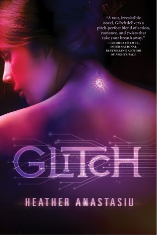
This week I picked Glitch by Heather Anastasiu. This book hasn't come out yet but I am hoping this is the final cover because I love it. Here's a little excerpt from the synopsis on Goodreads.com
In the Community, there is no more pain or war. Implanted computer chips have wiped humanity clean of destructive emotions, and thoughts are replaced by a feed from the Link network. 
When Zoe starts to malfunction (or "glitch"), she suddenly begins having her own thoughts, feelings, and identity. Any anomalies must be immediately reported and repaired, but Zoe has a secret so dark it will mean certain deactivation if she is caught: her glitches have given her uncontrollable telekinetic powers.
I think part of the reason I love this cover so much is because it seems to fit the book so well. It looks high-tech and other worldly. I am normally not a big fan of purple but it just sets the tone perfectly on this cover. I even like the font and normally I don't enjoy crazy fonts. This is one of those covers that would make me pick up the book and read the back of it, give it a chance just because the cover attracted my eye. I love the tattoo/chip/whatever that is on her neck, it makes me curious as to what the book is about and why she has it and that is exactly what a book cover should do.

The only thing I would change is the big author recommendation on the front. Do those thing have an actual name? My mind is blanking right now. I understand that it is a tool to show that the book is good because another well known author endorses it and people who read that author might pick up the book because of the endorsement. (Endorsement?! Is that the word I was looking for?) Still, I think it could have been placed somewhere else because it detracts a tiny bit from the beauty of the cover. It wouldn't stop me from picking the book up but it wouldn't make me pick it up on its own either.

Glitch is on my TBR list and I am looking forward to reading it when it comes out in August! 

Saturday, February 4, 2012

Shelf Candy Saturday


Shelf Candy Saturday is a fun feature that is hosted by Fivealarmbookreviews.com. The purpose is to show off book covers that we think are exceptionally beautiful/intriguing or just interesting!


I chose Providence by Jamie McGuire. I actually got this book before I read any of her other books only because I adored the cover. Usually I go for bright, bold colors but the black and white tones in this cover struck me as hauntingly beautiful. I'll be honest, I had no idea what the book was about when I purchased it but I was so intrigued! I wanted to know where he was at, why is he by himself? Is that a bag in his hand? Is he homeless? Are those churches in the back with the tall steeples or is it set in a different sort of time period than the modern age? The clouds are beautiful and slightly ominous, giving a feeling of heaviness despite them being the brightest thing on the cover. I even like the font that the title is written in though I don't like the signature typeface as much.

Tomorrow we'll get back on track with our 'booking through Sunday' feature and another review is coming up soon. Be forewarned, it is Shifter month so there will be quite a few shifter reviews coming up. I started off on a good note with Tales of Lunarmorte (series) by Samantha Young, hopefully I continue finding great, exciting reads!