
Shelf Candy Saturday is a fun feature that is hosted by Fivealarmbookreviews.com. The purpose is to show off book covers that we think are exceptionally beautiful/intriguing or just interesting!
This week I picked Glitch by Heather Anastasiu. This book hasn't come out yet but I am hoping this is the final cover because I love it. Here's a little excerpt from the synopsis on Goodreads.com
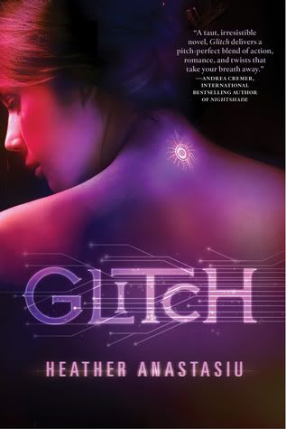
In the Community, there is no more pain or war. Implanted computer chips have wiped humanity clean of destructive emotions, and thoughts are replaced by a feed from the Link network.
When Zoe starts to malfunction (or "glitch"), she suddenly begins having her own thoughts, feelings, and identity. Any anomalies must be immediately reported and repaired, but Zoe has a secret so dark it will mean certain deactivation if she is caught: her glitches have given her uncontrollable telekinetic powers.I think part of the reason I love this cover so much is because it seems to fit the book so well. It looks high-tech and other worldly. I am normally not a big fan of purple but it just sets the tone perfectly on this cover. I even like the font and normally I don't enjoy crazy fonts. This is one of those covers that would make me pick up the book and read the back of it, give it a chance just because the cover attracted my eye. I love the tattoo/chip/whatever that is on her neck, it makes me curious as to what the book is about and why she has it and that is exactly what a book cover should do.
The only thing I would change is the big author recommendation on the front. Do those thing have an actual name? My mind is blanking right now. I understand that it is a tool to show that the book is good because another well known author endorses it and people who read that author might pick up the book because of the endorsement. (Endorsement?! Is that the word I was looking for?) Still, I think it could have been placed somewhere else because it detracts a tiny bit from the beauty of the cover. It wouldn't stop me from picking the book up but it wouldn't make me pick it up on its own either.
Glitch is on my TBR list and I am looking forward to reading it when it comes out in August!
This is a great cover. The font w/ the computer elements are especially perfect for the novel, according to the title and synopsis anyway. I still have this one on my TBR too.
ReplyDeleteI prefer that they keep the promotions on the back or inside flap. If I have taken the time to pick up the book, I will read that stuff either way. It does not have to scream, "Pick me!"
Fantastic Shelf Candy pick. Thank you so much for your post.
Hi! I like your cover..different and beautiful! Here is my Shelf Candy.
ReplyDeleteVidya @ Books Are Magic
The cover's really eye-catching. Great that you posted it.
ReplyDeletethis is a beautiful cover. Simple but yet eye catching. I agree that the endorsement or testimonial from another author is a little intrusive to the design. To be honest I don't pick up a book because another "big" author has endorsed it. I usually pick it up bc of the cover and then don't put it down if the synopsis is intriguing. :) Great choice for Shelf Candy!
ReplyDeleteI saw this on Goodreads, its beautiful.:D Great choice.
ReplyDeleteI am glad I am not the only one who thinks that about the writing on the front. FABR Steph is exactly right, if it was on the inside flap or the back, I would read it after I had already picked up the book because something else about it had caught my eye!
ReplyDeleteNice cover! I agree with you about the author blurb, it gets in the way. Thanks for sharing!
ReplyDeleteSteph @ Steph's Stacks Shelf Candy
Ooh, that's gorgeous! I love the colors and the glow on the back of her neck.
ReplyDeleteThanks for visiting my shelf candy, and I'm returning the follow. :)
This is such a BEAUTIFUL cover!! It's bold and very eye-catching. The little gizmo on her neck really stands out, and the tech-looking lettering is perfect for the plot. The color glides smoothly along the girl's back, turning to orange by the time it reaches her face. LOVE it!!
ReplyDeleteI totally agree with you about placing endorsements by other authors on the front cover. I wish they wouldn't do that! It definitely DOES detract from the design. In this case, I'd still pick up the book to investigate the storyline, but the endorsement would be a little bit of an eyesore for me. Why do that to such a GREAT cover?
Well, anyway...thanks for featuring this! Have a WONDERFUL weekend!! : )
Maria @ http://anightsdreamofbooks.blogspot.com/
Amazing cover! Thanks for sharing! I can't wait to read this. So much is said just from the cover!
ReplyDeleteYour blog looks really cool. I'm going to explore some more!
Find my shelf candy here. http://www.thewindypages.com/2012/02/shelf-candy-15.html
Happy reading!
Thanks everyone! I am looking forward to reading it too, I hate having to wait so long for it to be released!
ReplyDeleteI love this cover! Anyways, I was just stopping by to say, "Tag, you're it!" in my chain http://doodlesbookblog.blogspot.com/2012/02/book-tag.html
ReplyDelete